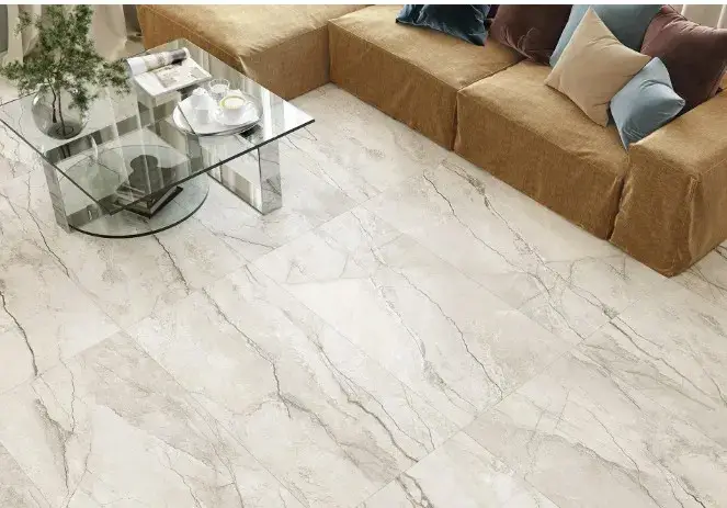
Yesterday, an ideal surface was considered to be monolithic slabs, a minimum of seams, and the maximum "luxury" per square meter. Today, fine work of textures and imperfections is returning to fashion: small-format tiles with different shades, a light wave of the surface and a lively edge. Paradoxically, it is precisely this "imperfect" finish that makes the interior visually more expensive than a perfectly flat large format: the eye reads complexity, and the hand reads depth.
A good example is the Equipe Artisan collection, which can be seen as a manifesto of new tactility and wabi-sabi. She demonstrates how valuable beauty is "with an error": varying the tone, shimmering glaze, barely noticeable irregularities create a handmade effect. It is also appropriate to recall the context of the design of the environment: equipe-artisan is a course towards comfort, tactility and human scale instead of an impersonal monolith.
Why does it look more expensive? Firstly, the perception of value is associated with a sense of piece-by-piece. Small formats and natural variation of tone form the "signature" of the craft.: It's like in high-fashion tailoring, where the stitch and texture of the fabric betray handwork. The seam becomes not an expense, but a stylistic device, like neat stitching, which gives the subject composure and rhythm.
Secondly, the optics. Small tiles with a light wave of surface and thick glaze break up the light into hundreds of highlights; there is a play of shadows along the edges and deep iridescences in the puddles of glaze themselves. It's like jewelry processing: the material "breathes", the reflections move with the observer. A large format, on the contrary, smooths out the nuances — a monolithic plane reads faster and seems easier, even if it is objectively more expensive by meter.
Third, tactility. We live with our bodies no less than with our eyes, and this is especially noticeable in everyday life. Fingers can easily distinguish the silkiness of the glaze, the light edge along the edge, and the soft joint with the seam. This is a "slow" sensor — it adds ritual and thus the quality of everyday life: water sliding over uneven tiles at the sink; the warm glow of the lamp, emphasizing the microrelief on the kitchen apron.
The aesthetics of wabi-sabi enhance the effect. She appreciates the time stamp and the nature of the material: not ideality, but acceptable asymmetry, nuance, and unpredictability. The Equipe Artisan collection works with this idea delicately: the variation of shade from tile to tile, the handmade-looking edge, the gloss, which thickens in places. Combinations of calm milky and dusty greens with deep indigo or graphite create a layered palette that is difficult to "read" at first glance, which means it remains interesting longer.
The practice of application shows how "imperfection" adds